SCREEN
BASED
DESIGN
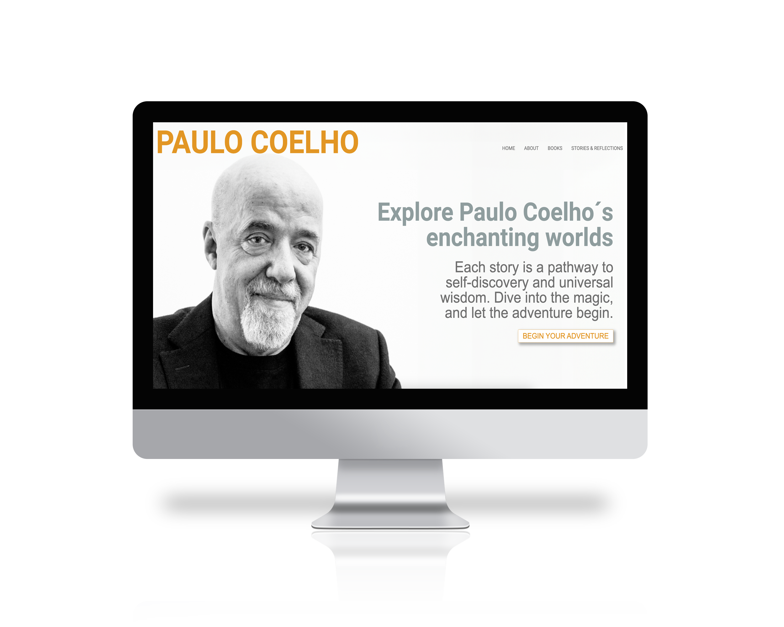

WEBSITE REDESIGN
For the screen based design course we were asked to choose a website to redesign. We were provided with an article, listing some of the worst designed websites out there. After browsing through this I chose the author Paulo Coelho´s website. The article´s reasoning for listing this website as a bad one, was that ”it felt like a fresh-out-the-box blog template from wordpress.” After going through the site there were a few other problems I noticed with this site: no home page, no information about the author or any of his books, too much text etc.
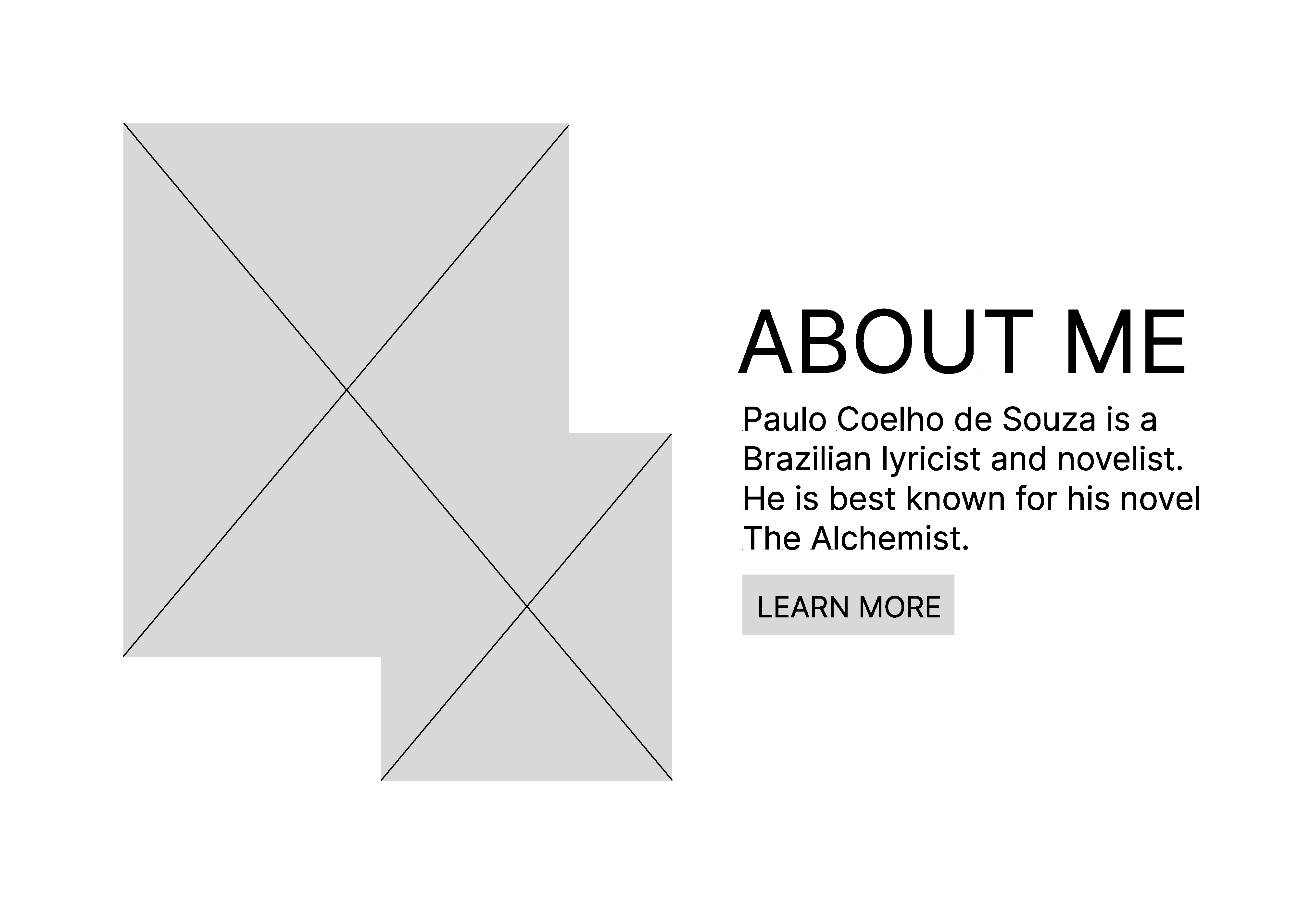
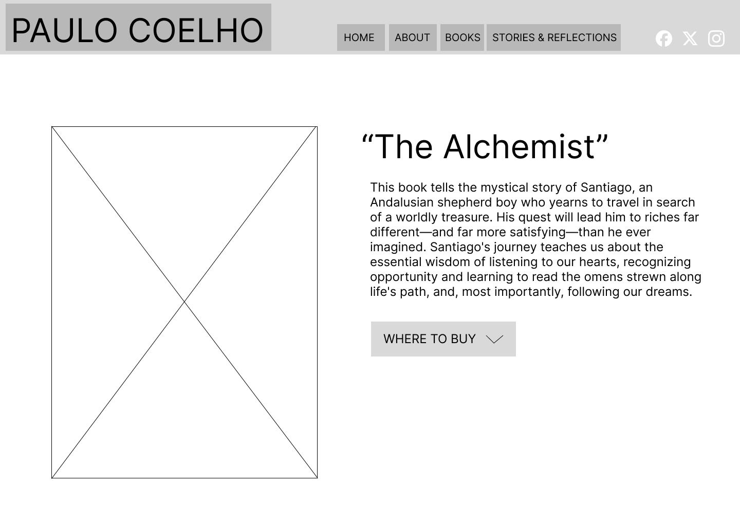
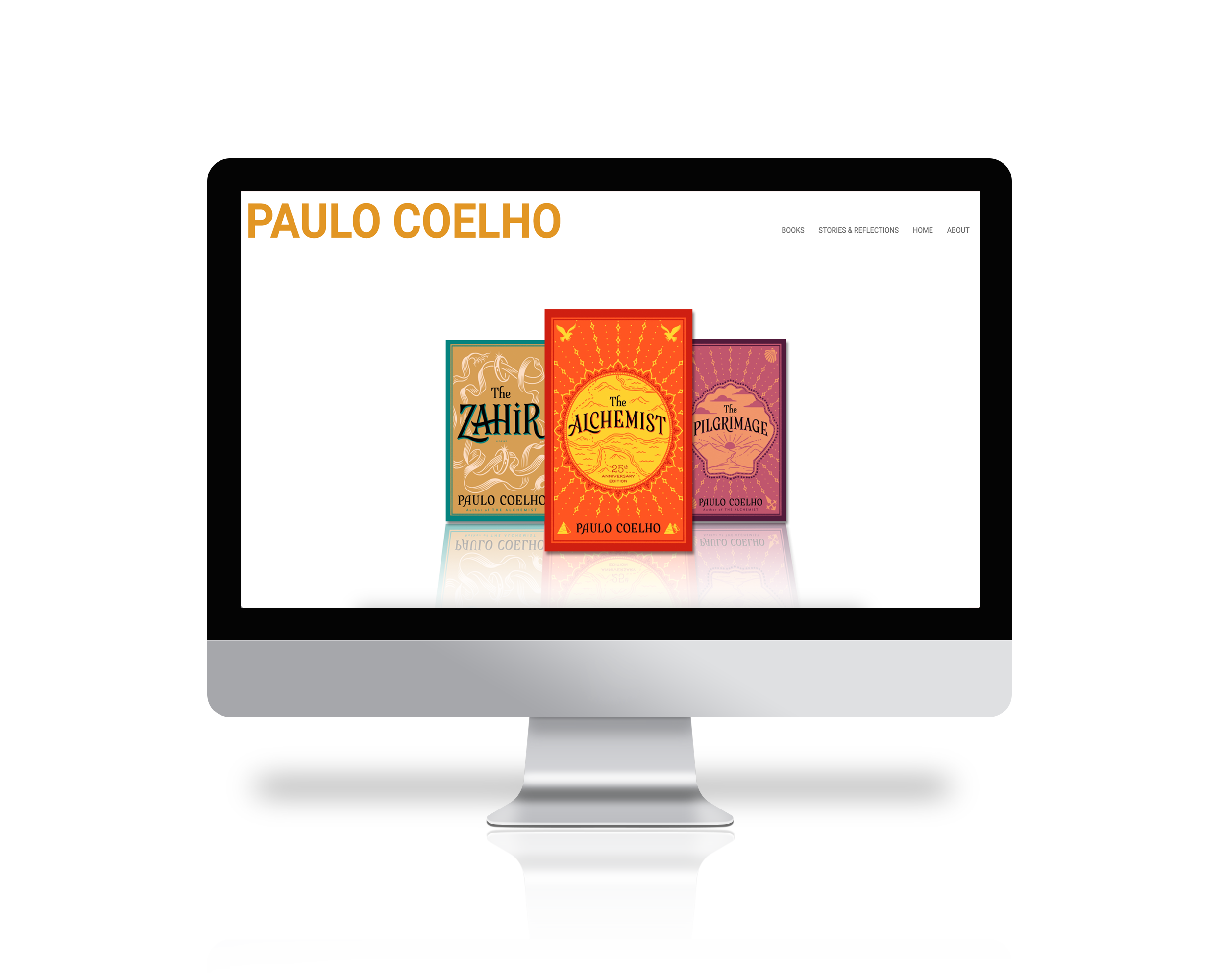
Firstly, this involved creating low fidelity wireframes which ultimately resulted in high fidelity wireframes as well as an interactive prototype in Figma. Here, both design and layout is in focus. This has to be both visually pleasing and accessible for everyone, taking into account people with different disabilities. Eventually this culminated in a finished website created in Webflow (link below).
CONCEPT
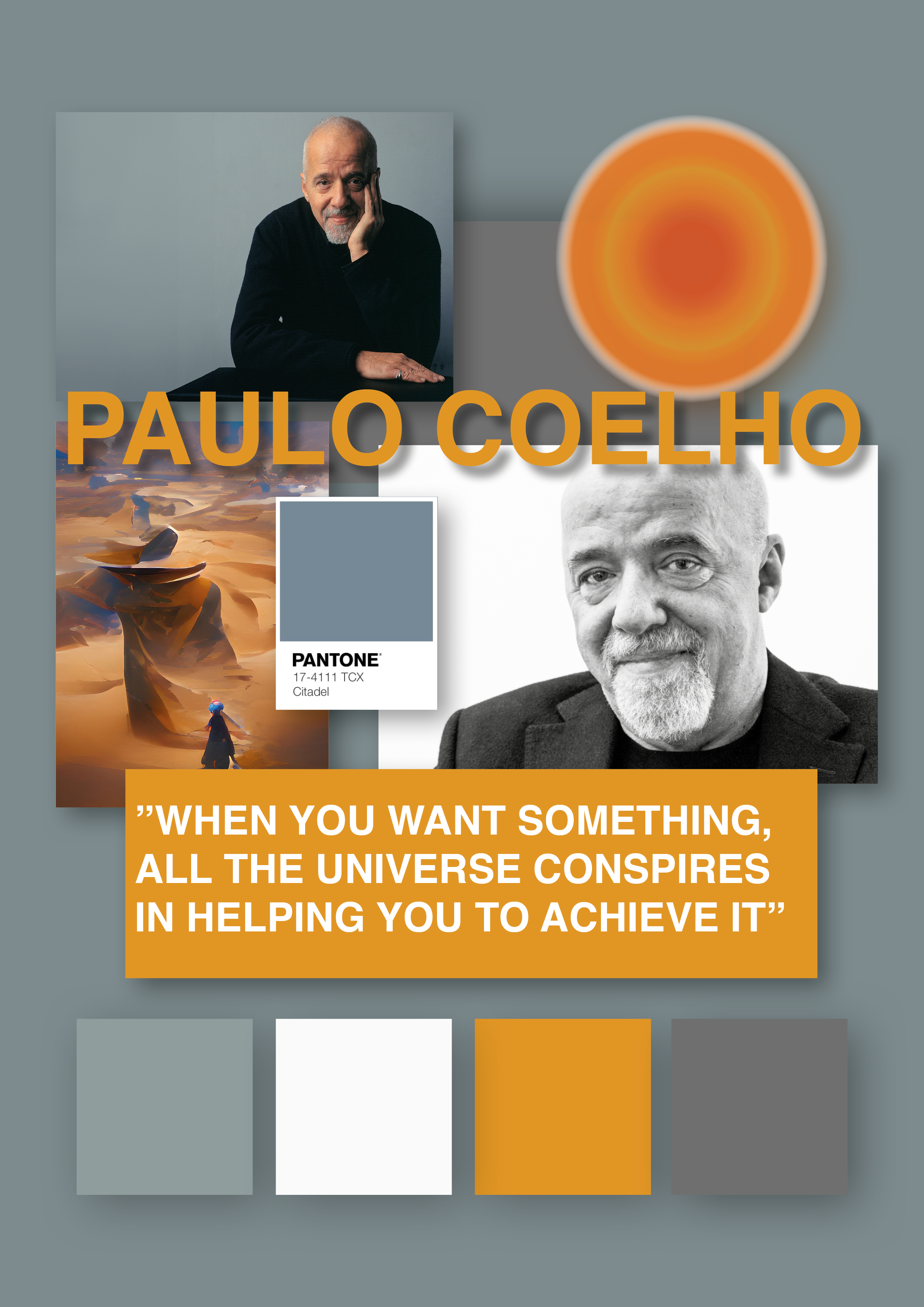
In the research I did for this redesign it became apparent that most of Coelho´s writing has spiritual and, in some capacity, magical properties with themes of being true to the self and finding a purpose in life. The Alchemist, which is Coelho´s most read story, is a story that especially conveys this and seems to be a favorite amongst his readers. Therefore this book became a big inspiration when designing the high fidelity wireframes. Specifically the bright orange color of this book cover and the desert scenery where most of the story takes place.
